
Monday starts with three emails marked urgent. A client says they already sent the tax form. Your team can't find it. A manager wants a status update on employee onboarding packets. Someone else asks which licenses expire soon. You open a spreadsheet, then a shared folder, then your inbox, then your notes. By lunch, you're still piecing together what should have been obvious.
That kind of document chaos isn't a personal failure. It usually means the process depends on memory, manual follow-up, and scattered records. When files arrive through email, chat, portals, and phone reminders, nobody gets a clean view of what's complete, what's missing, and what needs attention next.
That's where reporting and analytics become useful. Not as abstract business jargon, but as a practical way to regain control over document collection. Reporting tells you what's going on right now. Analytics helps you understand why requests stall, where delays keep repeating, and which issues deserve action first.
If your day feels buried under follow-ups, status checks, and paperwork, it helps to step back and rethink the system itself. A practical guide to less business admin can help frame that shift. So can a closer look at what a modern business document management system is supposed to do beyond simple storage.
Table of Contents
- From Document Chaos to Data Clarity
- Reporting vs Analytics What Is the Difference
- Key Document Collection Metrics for Your Industry
- Best Practices for Dashboard and Report Design
- How to Implement a Document Analytics Workflow
- How Superdocu Powers Your Analytics Strategy
- Conclusion From Data Chaos to Business Clarity
From Document Chaos to Data Clarity
A busy office manager in a legal firm might spend the morning chasing ID documents, signed forms, and proof of address. An HR coordinator might do the same with contracts, certifications, and onboarding records. A transportation company may be tracking licenses, vehicle papers, and expiring compliance documents. Different industries, same headache.
The trouble usually starts small. One missing file leads to a reminder email. Then someone updates a spreadsheet but forgets to tell the rest of the team. A client uploads the wrong version. Another sends a photo instead of the requested document. Soon, simple collection work turns into constant checking, correcting, and rechecking.
What chaos looks like in practice
These are common signs that document collection has become a reporting problem:
- Status lives in too many places: part in email, part in spreadsheets, part in someone's memory.
- Teams answer the same question repeatedly: “Did we receive it?” and “What's still missing?”
- Deadlines sneak up: people notice expired or incomplete records only when work is blocked.
- Managers get activity, not clarity: lots of updates, but no clean picture of progress.
When paperwork feels overwhelming, the issue usually isn't effort. It's the lack of a system that turns activity into visibility.
What data clarity changes
Clarity begins when every document request follows the same logic. You need a reliable way to see open requests, completed submissions, rejected files, and upcoming expirations without hunting through multiple tools.
This is why reporting and analytics became a core business discipline as organizations moved beyond historical summaries into systems that also explain patterns and predict outcomes, according to Domo's overview of analytics versus reporting. In plain language, reporting gives you the scoreboard. Analytics helps you coach the game.
For document collection, that shift matters. Instead of reacting to missing paperwork after it causes delays, you can spot bottlenecks early. Instead of guessing whether your reminders work, you can inspect patterns and improve the process. That's the difference between drowning in admin and running a controlled operation.
Reporting vs Analytics What Is the Difference
The easiest way to understand this is to think about a car.
Your dashboard shows your speed, fuel, and warning lights. It tells you what's happening. That's reporting. An engine diagnostic tool helps explain why a warning light came on and what might happen if you ignore it. That's analytics.
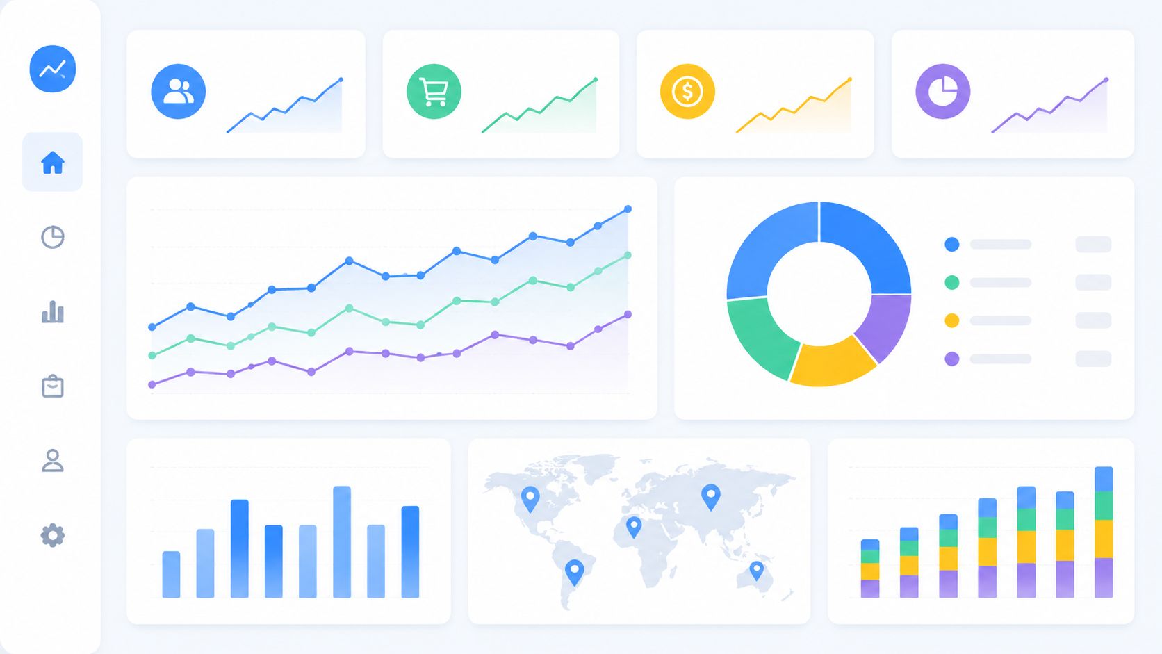
What reporting does
In business terms, reporting is the descriptive layer. It answers the question “What happened?” through standardized KPIs, recurring dashboards, and stakeholder-friendly summaries, as explained by Info-Tech's guidance on building a reporting and analytical insights strategy.
For document collection, reporting might show:
- how many requests are open
- which files were submitted this week
- how many items are still pending
- which documents were rejected for missing information
- which records are close to expiration
This kind of reporting is repeatable. It uses agreed definitions, so the operations team and leadership team don't end up with different numbers for the same process.
What analytics adds
Analytics goes a step further. It asks:
- Why are certain requests always delayed?
- Which step causes the most rework?
- Which groups submit complete documents faster than others?
- What pattern suggests a request may miss its deadline?
A report might show that onboarding packets are pending. Analytics looks for the reason. Maybe one document type confuses people. Maybe reminders go out too late. Maybe one intake team uses different instructions than another.
A simple office example
Suppose you manage employee onboarding.
A report says:
- 18 onboarding packets are open
- 7 are complete
- 5 are missing ID
- 6 are waiting for signed policy documents
Analytics asks:
- Are signed policy documents delayed because the instructions are unclear?
- Do delays happen more often when candidates receive multiple requests at once?
- Are some forms rejected more often because people upload the wrong format?
That's the practical split. Reporting gives the snapshot. Analytics gives the explanation and supports next decisions.
Practical rule: If a metric helps you monitor work, it's probably reporting. If it helps you diagnose causes or improve future outcomes, it's analytics.
Why people mix them up
Individuals often first encounter data through dashboards. So they assume analytics means charts. But a chart alone doesn't explain anything. It only displays information.
That's why it helps to keep one clear mental model. Reporting shows the dashboard. Analytics helps you understand the engine. In document collection, you need both. Without reporting, you can't see the workload. Without analytics, you can't improve it.
Key Document Collection Metrics for Your Industry
The right metrics depend on the kind of documents you collect. A law office won't watch the exact same signals as a staffing firm or mortgage broker. Still, the logic stays the same. Start with the decisions you need to make, then track the measures that support those decisions.
High-quality reporting depends on a structured process that includes defining goals, compiling clean data, building reports, and reviewing findings, as described in this guide to data analytics reporting in 9 steps. That matters because a pretty dashboard won't help if the underlying document records are incomplete or inconsistent.
Choose metrics that connect to work
A useful KPI should help someone act. If a number doesn't change behavior, it's probably just decoration.
For example, “documents received” may be useful for volume tracking. But “pending requests by age” is often more actionable because it tells your team where delays are piling up.
Key Document Collection KPIs by Industry
| Industry | Key Performance Indicator (KPI) | What It Measures |
|---|---|---|
| Juridique | Matter intake completion status | Whether required client documents for a case have been fully submitted |
| Juridique | Document rejection rate | How often submissions are unusable because they are incomplete, unclear, or incorrect |
| HR and staffing | Onboarding packet completion time | How quickly new hires or candidates submit all required documents |
| HR and staffing | Missing critical document count | How many records still lack items such as IDs, contracts, or certifications |
| Real estate | Application completeness rate | Whether tenant or buyer applications arrive with all supporting documents |
| Real estate | Time to document approval | How long it takes staff to review and accept submitted paperwork |
| Mortgage and financial services | Outstanding borrower conditions | How many required items are still missing before a file can move forward |
| Mortgage and financial services | Resubmission frequency | How often applicants need to send corrected or replacement documents |
| Immigration | Case file readiness status | Whether all required documents for a submission are present and valid |
| Immigration | Upcoming expiration count | How many passports, permits, or supporting records need renewal attention soon |
| Transport | Driver compliance document status | Whether licenses, certifications, and vehicle-related records are current |
| Transport | Expiring document queue | Which records need action before they become a compliance issue |
| Construction / BTP | Subcontractor document completeness | Whether insurance, safety, and registration paperwork is fully collected |
| Construction / BTP | Validation turnaround time | How quickly staff review and verify submitted files |
A better way to read these KPIs
Some metrics tell you about flow. Others tell you about quality.
- Flow metrics: completion time, pending status, approval turnaround
- Quality metrics: rejection rate, resubmission frequency, missing critical items
- Risk metrics: expirations, compliance status, incomplete case readiness
You don't need dozens of them. A short set is usually stronger, especially when each metric has a clear owner.
If two managers define the same KPI differently, the report will create arguments instead of decisions.
Common metric mistakes
Teams often get stuck in three places:
Tracking volume without context
“We received many files this week” doesn't tell you whether the work is moving.Mixing process and outcome measures
A submission count and a compliance-ready count are not the same thing.Using vague labels
“Complete” must mean one thing, not five different interpretations across departments.
A good metric acts like a clean checklist item. Everyone should know what it means, when it updates, and what action follows when it turns red, late, missing, or overdue.
Best Practices for Dashboard and Report Design
A clean-looking dashboard can still be dangerous. If the numbers aren't trusted, people either ignore the report or make decisions they shouldn't make.
That's why dashboard design starts with data trust, not colors or chart types. Many organizations treat analytics as a dashboarding problem, but it's really a decision-quality problem. Guidance from Luzmo argues that quality, governance, definitions, ownership, lineage, access, compliance, and security determine whether teams can rely on metrics at all, and that data trust should be treated as a first-class analytics concern.

Start with trusted inputs
When document teams say a dashboard is “wrong,” they usually mean one of these things:
- Definitions are fuzzy: one person marks a file complete after upload, another only after review.
- Validation is inconsistent: some records are checked carefully, others are waved through.
- Ownership is unclear: nobody knows who fixes bad entries.
- Version control is weak: people export data, edit it offline, and circulate competing copies.
A report can't solve those issues. The process has to solve them first.
Design for decisions, not decoration
The best dashboard for a busy office manager is usually simple. It should answer immediate operational questions in seconds.
A useful document dashboard often includes:
- Current workload: open requests, pending reviews, stalled submissions
- Exceptions: rejected files, missing mandatory items, records near expiration
- Trend view: whether backlogs are improving, flat, or worsening
- Ownership view: which team, case owner, or department needs to act
Short labels help. So do clear filters. If people need a training manual to read the report, it's too complicated.
Build reports people can scan
Think of dashboard layout like a front desk.
The items you need most should be easiest to reach. Put the most important operational signals at the top. Push secondary detail lower down. If every chart shouts for attention, nothing stands out.
Here are a few practical design rules:
- Use one definition for each KPI: don't let “completed” vary by team.
- Highlight exceptions first: overdue, rejected, and expiring items deserve visual priority.
- Reduce clutter: remove charts that don't trigger action.
- Match reports to roles: managers, reviewers, and leadership rarely need the same view.
For broader workflow discipline, this article on best practices for document management is a useful companion because strong reports depend on strong document handling behind the scenes.
Better reporting of bad data only helps teams make bad decisions faster.
Use alerts carefully
Automated alerts are helpful when they support action. They become noise when they fire too often or go to the wrong people.
Good alert examples include:
- a compliance document nearing expiration
- a workflow stalled in one stage too long
- a high-priority request missing a mandatory file
- repeated submission failure for the same document type
Bad alerts are broad, repetitive, and unactionable. “Several items need review” is weaker than “three driver certifications expire soon and need validation.”
How to Implement a Document Analytics Workflow
Many teams don't need a giant business intelligence project. They need a working process that starts small, uses real decisions, and improves over time.
A mature analytics stack should follow a use-case-driven pipeline: identify the business decision, accumulate and master the data, then package outputs for each use case. That staged model, described in ITD's article on reporting maturity and BI progression, helps teams move from basic tracking toward deeper analysis without creating reporting sprawl.
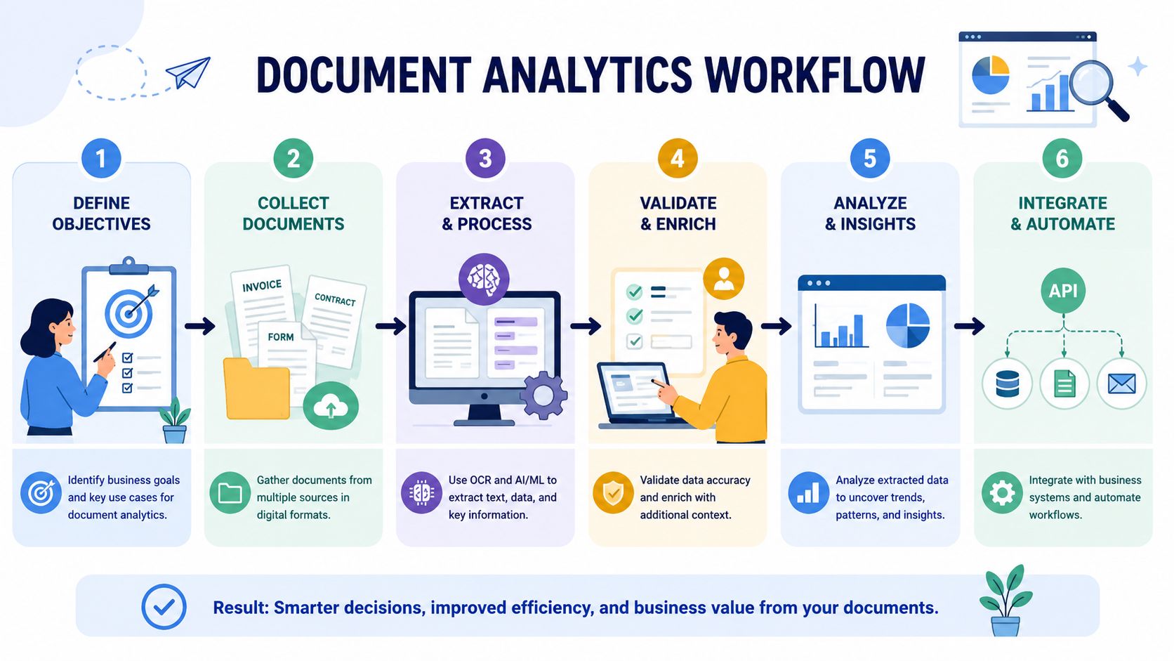
Step 1 Define the business decision
Don't begin with charts. Begin with a question someone needs answered.
Examples:
- Which client files are most likely to delay case opening?
- Where does onboarding get stuck most often?
- Which expiring records need review this month?
- Which document type creates the most back-and-forth?
A good decision question keeps the data work grounded.
Step 2 Centralize document activity
If requests arrive through inboxes, shared folders, and private messages, your reporting will stay messy. Bring requests, submissions, status changes, and validations into one consistent workflow.
That doesn't mean every document must live in one place forever. It means the process data should be captured in a single system of record, so your team can trust the status.
Step 3 Standardize the status logic
Many teams frequently stumble at this stage. Before building reports, define the states that matter.
A simple document workflow might include:
- Requested
- Submitted
- Under review
- Accepted
- Rejeté
- Expired or needs renewal
Once these states are clear, reports stop turning into debates.
Step 4 Build a small reporting layer first
Start with a compact operational dashboard. Focus on a few signals that matter daily.
Good first-report candidates:
- open requests by stage
- missing mandatory documents
- rejected submissions needing correction
- items approaching expiration
Avoid trying to answer every possible question in version one.
Field note: The first useful dashboard is usually narrower than teams expect. That's a strength, not a weakness.
Step 5 Automate delivery and review
A report that nobody checks won't change anything. Put reports where people already work. Schedule delivery. Set a review rhythm.
This can be weekly for leadership, daily for operations, or tied to specific workflows such as onboarding or compliance review.
Step 6 Add analytics after the reporting becomes stable
Only after the core reporting is clean should you ask bigger diagnostic questions.
At that stage, look for patterns such as:
- recurring delays by document type
- rejection clusters by office or team
- seasonal peaks in expiring records
- client groups that need different reminder timing
At this point, document collection shifts from passive admin work to informing process improvement.
How Superdocu Powers Your Analytics Strategy
When document collection is organized well, the data behind it becomes far more useful. That's the practical link between workflow software and reporting maturity. You can't build dependable analytics on top of scattered requests and manual follow-up.
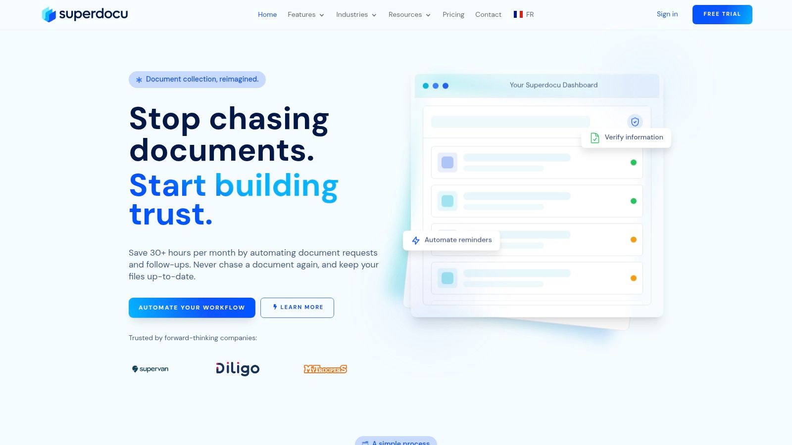
Where visibility starts
For many teams, the first missing piece is a live operational view. If staff have to open multiple tools just to answer “what's pending?” the reporting layer stays fragile.
A centralized review area such as a validation dashboard for document submissions helps turn raw activity into usable status data. That matters because reporting works best when every submission follows the same lifecycle and validation rules.
Features that support reporting and analytics
Several capabilities matter more than they first appear:
- Structured request workflows: these create cleaner status tracking than ad hoc email collection.
- Automated reminders: these reduce the need for manual chasing and make follow-up patterns visible.
- Expiration tracking: this supports proactive reporting around renewals and compliance risk.
- Templates by industry: these help teams standardize what “complete” means for different document sets.
- Integrations: these make it easier to connect document operations with wider business processes.
Why this matters strategically
A document platform becomes part of your analytics strategy when it captures process events consistently. Every request sent, file uploaded, validation decision, rejection, and renewal reminder creates operational signals.
Those signals can support better management questions:
- Where are delays repeating?
- Which requests generate the most resubmissions?
- Which workflows need simpler instructions?
- Which records create recurring compliance pressure?
That's the bigger shift. Document collection stops being a side task handled through inbox cleanup. It becomes a managed process that can be monitored, improved, and trusted.
Conclusion From Data Chaos to Business Clarity
Most paperwork problems don't begin with too many documents. They begin with too little visibility. When requests, submissions, reviews, and deadlines are scattered across tools and people, your team spends more time searching than deciding.
Good reporting and analytics change that. Reporting gives you a clear operational picture. Analytics helps you understand delay patterns, quality issues, and repeat bottlenecks. In document-heavy work, that means fewer surprises, less manual chasing, and better decisions about where to focus effort.
The big win isn't just nicer dashboards. It's control. You know what's missing, what's stuck, what's close to expiring, and what needs action today. That clarity improves internal workflows and also makes life easier for clients, candidates, employees, and partners who are trying to submit the right documents the first time.
If your team is still running document collection through email threads and spreadsheets, the next improvement doesn't need to be complicated. It just needs to be structured, consistent, and visible.
If you want a simpler way to collect, validate, track, and report on business documents, take a look at Superdocu. It's built to turn document chasing into a clear workflow your team can manage.